This is a tutorial for anyone wishing to build a free, CMS-powered blog using Gatsbyjs, Github, and Forestry. Some benefits of this approach are:
- Free hosting on github pages.
- Lovely blog-writing experience using a CMS text editor, with integrated media library.
- Build the site layout in react and sass with built-in hot reloading.
Here is a streamlined tutorial for building and deploying a blog in GatsbyJS, leaving room for your own customization and styling.
Gatsby's documentation is fantastic and thorough, but I always find I have to cherry pick across many different documents and repository README's to figure out seemingly basic things so I thought I'd offer a tutorial of how I've gone about it.
Basic setup
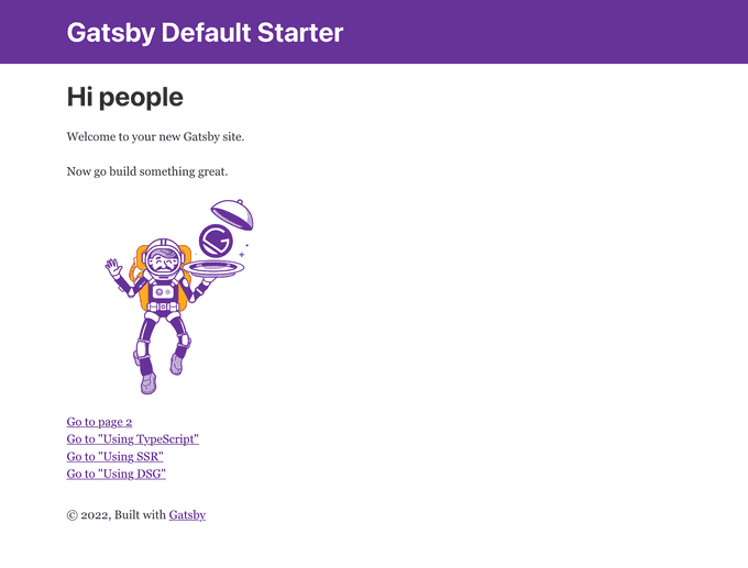
Gatsby makes this pretty easy for you. We're going to use the gatsby-default-starter because it provides some really good boiler plate for things like Seo, Layout, and Header components.
npx gatsby new tutorial-blog https://github.com/gatsbyjs/gatsby-starter-defaultYou can now cd into your new directory and run npm run develop to see your site on http://localhost:8000.
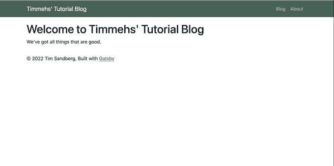
Tada 🎉:
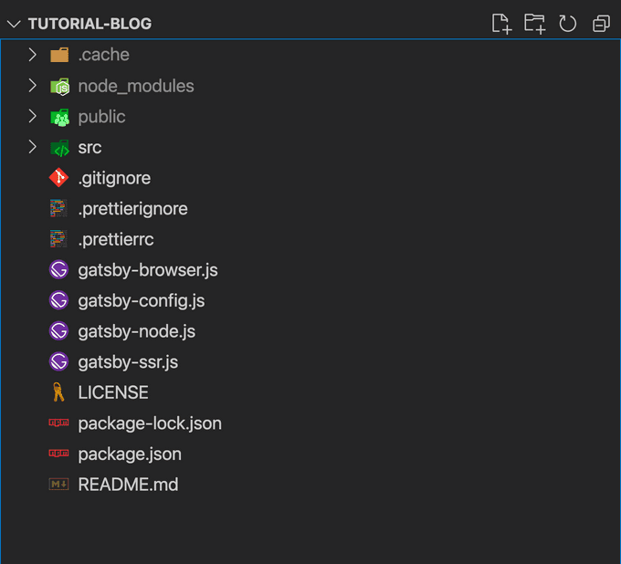
Opening the directory in your text editor, you should see a similar structure to this:
Now lets change a bunch of stuff.
Configuration
Here we'll just run through some initial basic config, which should serve as a little tour of important places in your gatsby project.
gatsby-config.js
module.exports = {
  siteMetadata: {
    title: `Timmehs' Tutorial Blog`, // <-- Change
    description: `A blog tutorial using Gatsbyjs, Github, and Forestry CMS`, // <-- Change
    author: `Tim Sandberg`, // <-- Change
    siteUrl: `https://timmehs.github.io/tutorial-blog`, // <-- Change
  },
  plugins: [
    `gatsby-plugin-react-helmet`,
    `gatsby-plugin-image`,
    {
      resolve: `gatsby-source-filesystem`,
      options: {
        name: `images`,
        path: `${__dirname}/src/images`,
      },
    },
    `gatsby-transformer-sharp`,
    `gatsby-plugin-sharp`,
    // Delete `gatsby-plugin-manifest` entry
  ],
}
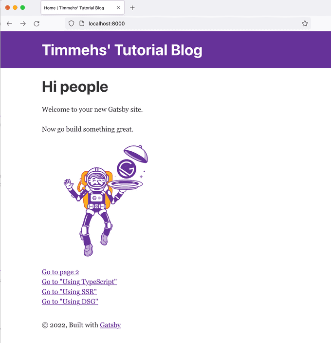
With those changes, and the updates to your siteMetadata in gatsby-config.js you should see some changes on your page.
run
# for yarn
yarn develop

# for npm
npm run develop
Your layout component is grabbing that updated info using graphql and plugging it into the Header component. Here's that query shown here:
src/components/layout.js
import * as React from "react"
import PropTypes from "prop-types"
import { useStaticQuery, graphql } from "gatsby"

import Header from "./header"
import "./layout.css"

const Layout = ({ children }) => {
  const data = useStaticQuery(graphql`
    query SiteTitleQuery {
      site {
        siteMetadata {
          title
        }
      }
    }
  `)
  ...
You'll also notice the title of the page in the browser tab has updated, this is because the SEO component does the same thing. I like to refactor the Seo component to live within the Layout, but for simplicity's sake let's continue with what we have here.
Some boilerplate cleanup
Note: You can let these files and packages be if you want to explore them later, but we wont discuss them in this tutorial
run
yarn remove gatsby-plugin-manifest gatsby-plugin-offlineDelete the following files:
gatsby-ssr.js
src/templates/gatsby-dsg.js
src/pages/using-ssr.js
src/pages/using-typescript.tsx
Since we're deleting the dsg template, we'll need to remove this code so it doesn't try and make a page out of it:
gatsby-node.js
// We'll return to this file later, so just delete the inner lines

exports.createPages = async ({ actions }) => {
  // DELETE ME:
  // const { createPage } = actions
  // createPage({
  //   path: "/using-dsg",
  //   component: require.resolve("./src/templates/using-dsg.js"),
  //   context: {},
  //   defer: true,
  // })
}
You can read up on these removed items here, but I've deemed them out of scope for this tutorial:
Styles
Add sass and bootstrap to your project. I'll use components from react-bootstrap later on, so best not to skip.
run
# Install packages
yarn install bootstrap react-bootstrap sass gatsby-plugin-sass

# Remove old stylesheet
rm src/components/layout.css

# Create new styles directory and scss stylesheet
mkdir src/styles
touch src/styles/bootstrap.scss
Add gatsby-plugin-sass to plugins:
gatsby-config.js
module.exports = {
  siteMetadata: {
    ...
  },
  plugins: [
    `gatsby-plugin-sass`, // <-- New
    `gatsby-plugin-react-helmet`,
    `gatsby-plugin-image`,
    {
      resolve: `gatsby-source-filesystem`,
      options: {
        name: `images`,
        path: `${__dirname}/src/images`,
      },
    },
    `gatsby-transformer-sharp`,
    `gatsby-plugin-sharp`,
  ],
}
Update style import in layout.js
src/components/layout.js
import * as React from "react"
import PropTypes from "prop-types"
import { useStaticQuery, graphql } from "gatsby"

import Header from "./header"
// import "./layout.css" delete
import "../styles/bootstrap.scss"
Customize and import bootstrap:
src/styles/bootstrap.scss
/**
 * Bootstrap Overrides - full list of customizable variables here:
 * - https://github.com/twbs/bootstrap/blob/main/scss/_variables.scss
 * This is my preferred method of customizing bootstrap themes.
 */
$primary: #496257;

/**
 * Bootstrap
 * */
@import "~bootstrap/scss/bootstrap.scss";
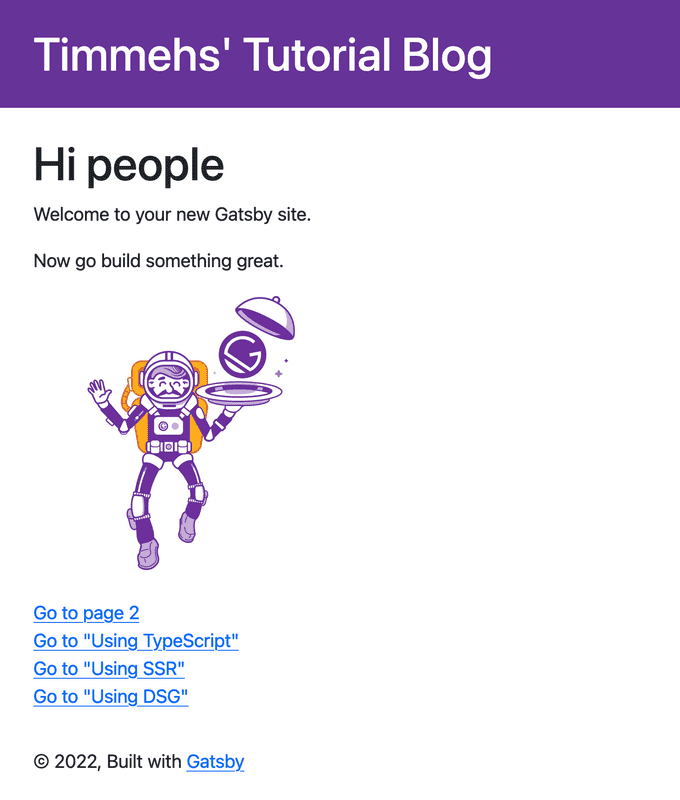
To make sure it's working, and our styles are hooked up, lets restart the server and check that everything works at http://localhost:8000.
Site structure and navigation
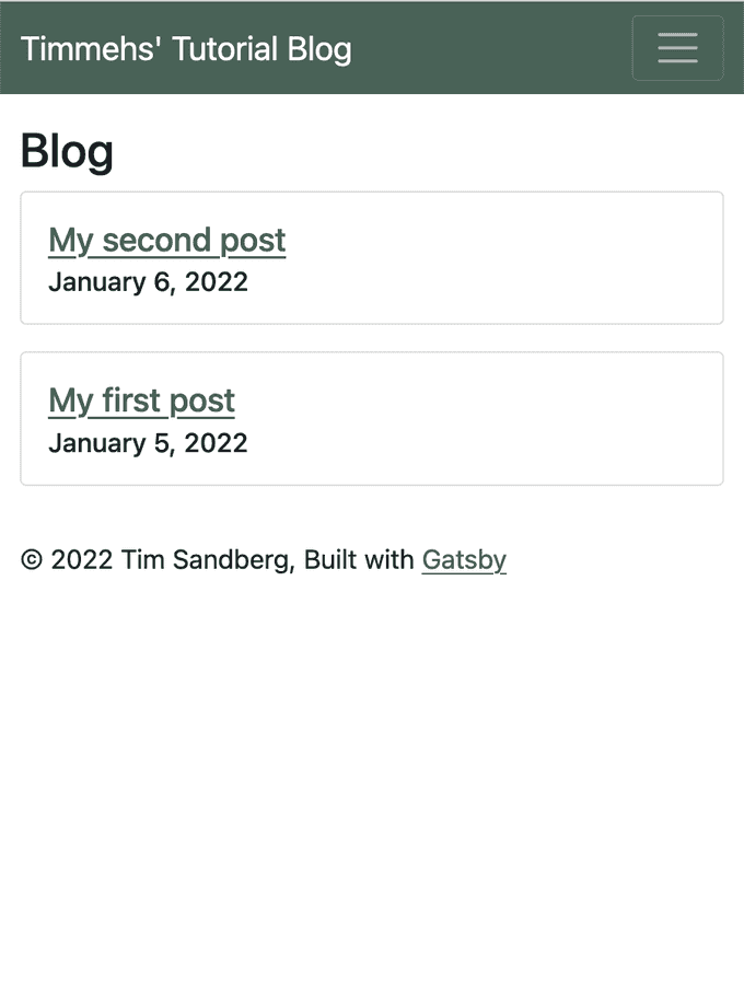
With react-bootstrap, our header component can be simply refactored into a responsive nav header which collapses to a dropdown for mobile screens.
src/components/header.js
import * as React from "react"
import { Link } from "gatsby"
import { Container, Nav, Navbar } from "react-bootstrap"
import PropTypes from "prop-types"

const links = [
  { text: "Blog", to: "/blog" },
  { text: "About", to: "/about" },
]

const Header = ({ siteTitle }) => (
  <Navbar bg="primary" expand="lg" variant="dark">
    <Container fluid="lg">
      <Navbar.Brand to="/" as={Link}>
        {siteTitle}
      </Navbar.Brand>
      <Navbar.Toggle aria-controls="basic-navbar-nav" />
      <Navbar.Collapse id="basic-navbar-nav">
        <Nav className="ms-auto">
          {links.map(({ text, to }) => (
            <Link
              key={`header-link-${to}`}
              className="nav-link"
              activeClassName="active"
              to={to}
            >
              {text}
            </Link>
          ))}
        </Nav>
      </Navbar.Collapse>
    </Container>
  </Navbar>
)

Header.propTypes = {
  siteTitle: PropTypes.string,
}

export default Header
Note: As with any bootstrap classes or react-bootstrap components used in this tutorial, you can read up on customization options at their respective websites:
Next let's update our index.js and add the two other pages linked to in our new navbar.
src/pages/index.js
import * as React from "react"

import Layout from "../components/layout"
import Seo from "../components/seo"

const IndexPage = () => (
  <Layout>
    <Seo title="Home" />
    <h1>Welcome to Timmehs' Tutorial Blog</h1>
    <p>We've got all things that are good.</p>
  </Layout>
)

export default IndexPage
src/pages/blog.js (new)
import * as React from "react"
import Layout from "../components/layout"
import Seo from "../components/seo"

const BlogPage = () => (
  <Layout>
    <Seo title="Blog" />
    <h1>Blog</h1>
    {/* Blog posts will go here */}
  </Layout>
)

export default BlogPage
src/pages/about.js (new)
import * as React from "react"

import Layout from "../components/layout"
import Seo from "../components/seo"

const AboutPage = () => (
  <Layout>
    <Seo title="About" />
    <section>
      <h1>About</h1>
      <p>
        This blog is built with Gatsbyjs, Bootstrap, and Forestry. It is the
        demo for the tutorial found here:{" "}
        <a href="https://github.com/Timmehs/tutorial-blog">repo</a>.
      </p>
    </section>
  </Layout>
)

export default AboutPage
As you will see, any files under the src/pages directory are automatically turned into pages in your website by gatsby.
Note: As you click around via the header navigation, you may notice that navigation is super snappy. That's because we're using Gatsby's <Link /> component, which has some magic to it (more on that here).
Blog posts from markdown
This is the standard static-site-generator functionality we're all here for. The plumbing basically works like this:
- gatsby-transformer-remark is a plugin we'll add that will transform markdown files into data nodes with frontmatter and html.
- We'll query for these nodes in our blog index to show a list of them to navigate to.
- We'll create a specially named template file name
src/pages/blog/{MarkdownRemark.parent__(File)__name}.jsthat will automatically create blog post pages using the jsx template inside.
Sound like a lot? Well it is, kind of. Let's get started!
Config for blog posts
Install gatsby-transformer-remark to your project.
run
yarn add gatsby-transformer-remarkAdd a new gatsby-source-filesystem block and the gatsby-transformer-remark plugin
gatsby-config.js
module.exports = {
  ...
  plugins: [
    ...
    {
      resolve: `gatsby-source-filesystem`,
      options: {
        name: `posts`,
        path: `${__dirname}/content/blog`,
      },
    },
    `gatsby-transformer-remark`,
	...
  ],
}
Adding blog posts
Create content folder and two blog post files. Adding blogposts after connecting a CMS will be much more convenient, but we're still in the nuts and bolts.
run
# from project root
mkdir content/
touch content/my-first-post.md content/my-second-post.md
Note the top section is surrounded above and below by the --- characters, this tells remark that these fields are frontmatter, separate from the body of the post. You can add any fields here you like, and they will be filterable in graphql.
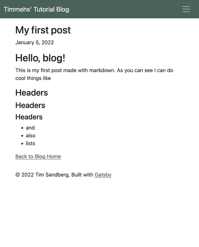
content/blog/my-first-post.md
---
title: My first post
date: 2022-01-05
---

# Hello, blog!

This is my first post made with markdown.
As you can see I can do cool things like

## Headers

### Headers

#### Headers

- and
- also
- lists
content/blog/my-second-post.md
    ---
    title: My second post
    date: 2022-01-06
    ---

    # Me again

    Really I just made this post to prove I could.
Listing blog posts at /blog
Here we add a page query to our blog.js page to grab basic information about our posts and list it.
src/pages/blog.js
import { graphql } from "gatsby"
import * as React from "react"
import { Card, Row } from "react-bootstrap"
import Layout from "../components/layout"
import Seo from "../components/seo"

const BlogPage = ({ data }) => (
  <Layout>
    <Seo title="Blog" />
    <h1>Blog</h1>
    {data.posts.nodes.map(({ id, frontmatter }) => (
      <Card key={id} className="mb-3">
        <Card.Body>
          <Card.Title>{frontmatter.title}</Card.Title>
          <Card.Subtitle>{frontmatter.date}</Card.Subtitle>
        </Card.Body>
      </Card>
    ))}
  </Layout>
)

export const query = graphql`
  {
    posts: allMarkdownRemark {
      nodes {
        id
        frontmatter {
          title
          date(formatString: "LL")
        }
      }
    }
  }
`

export default BlogPage
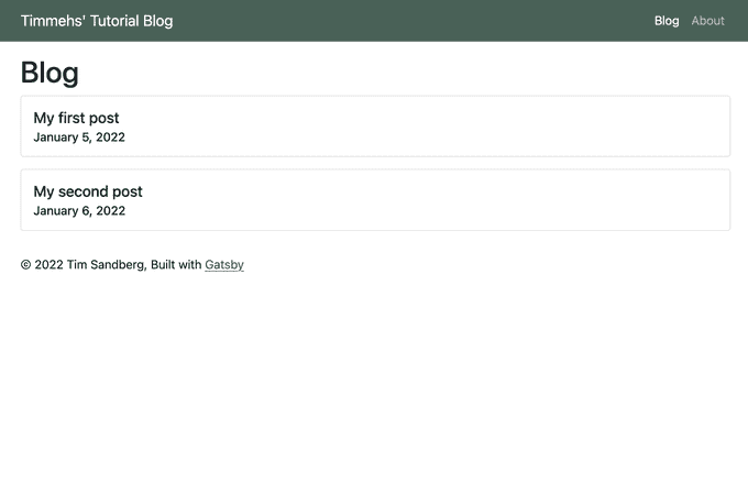
With that, we have a blog index!
Prototyping Queries
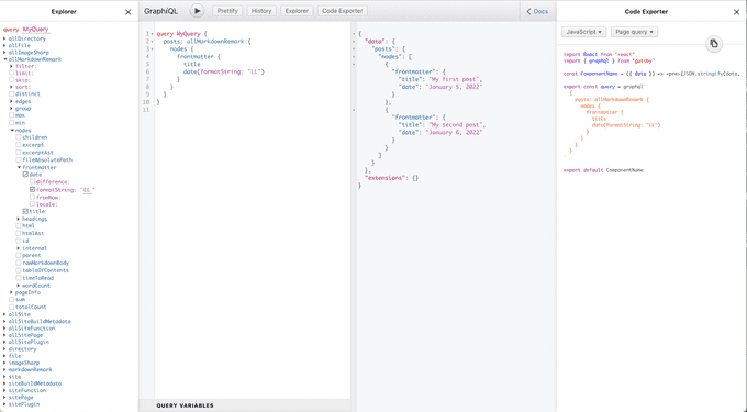
Make sure to leverage the graphql tool on http://localhost:8000/___graphql whenever you need to prototype a query. It's also a great place to poke around and see how Gatsby creates the data layer. Here's a screenshot from me prototyping this particular query, it even gives you code to copy:
Define a blog post template
Now we create a specially named file under src/pages that contains a template for our blog posts. Create a directory named src/pages/blog. This will namespace our blog posts to the /blog route. Then create a file carefully named:
src/pages/blog/{MarkdownRemark.parent__(File)__name}.jsThis tells Gatsby to generate a page for all MarkdownRemark nodes (all of our .md files) at the route blog/<file name>. Read up on more capabilities of the File system route API here: https://www.gatsbyjs.com/docs/reference/routing/file-system-route-api/
Lets make our actual template in that file.
src/pages/blog/{MarkdownRemark.parent__(File)__name}.js
import React from "react"
import Layout from "../../components/layout"
import Seo from "../../components/seo"
import { graphql, Link } from "gatsby"

export default function BlogPost({ data }) {
  const { frontmatter, html } = data.post

  return (
    <Layout>
      <Seo title="Blogpost" />
      <h1>{frontmatter.title}</h1>
      <p>{frontmatter.date}</p>
      <div dangerouslySetInnerHTML={{ __html: html }} />
      <Link to="/blog">Back to Blog Home</Link>
    </Layout>
  )
}

export const pageQuery = graphql`
  query ($id: String!) {
    post: markdownRemark(id: { eq: $id }) {
      frontmatter {
        title
        date(formatString: "LL")
      }
      html
    }
  }
`
Now if you visit http://localhost:8000/blog/my-first-post you should see your post, all nicely formatted. Well OK, the formatting needs work but you've got bootstrap installed and waiting to be leveraged.
Link to posts from the blog index
Update out blog.js page to link the blog title the the post itself:
// Add "Link" to imports from gatsby
import { graphql, Link } from "gatsby"

...

const BlogPage = ({ data }) => (
  ...
    ...
    <Card.Title>
      // Wrap the title text in a Gatsby Link component
      <Link to={`/blog/${parent.name}`}>{frontmatter.title}</Link>
    </Card.Title>
    ...
  ...
)

// Update the query to get the file name for the post
export const query = graphql`
  {
    posts: allMarkdownRemark {
      nodes {
        id
        frontmatter {
          title
          date(formatString: "LL")
        }
        parent {
          ... on File {
            name
          }
        }
      }
    }
  }
`

export default BlogPage
You're done!
This post is now a massive monstrosity so I will leave it here.
In the next post we'll cover:
- publishing to github pages
- connecting with ForestryIO CMS
- Managing multiple content types

